
We May Only Be Documenting 10% of All COVID Cases
/Yes, there may be a million cases a day right now.
Over the past week, I’ve been spending a lot of time looking at this graph – the count of COVID cases in the US.

And specifically, I’ve been looking at this part of this graph… this recent uptick in cases. Because, anecdotally, this seems to be way off.

Why do I say that? Well, to be honest, because it seems like a lot more people than this have COVID right now.
Just last week, a school in the town next to mine shut down due to too many teachers being absent.
We had a kidney symposium scheduled here at Yale, and two of our five key speakers had to cancel due to personal or family COVID infections.
Here’s a (carefully redacted) email I got just on Friday from a colleague whose kids have COVID.

And here’s one from my kid’s school from earlier in the week, noting 9 new cases in a single day.

Residents and fellows are calling out sick from the hospital as well. It feels, frankly, like a bit of an outbreak.
It seems like a worse outbreak than the reported case numbers suggest.
But my only evidence that the case rates are higher than reported is anecdote, and, as I often tell the med students, anecdotes are not evidence.
So I decided to do my best this week to try to figure out what the case rates might actually be in this country right now. But this time, using data.
Let’s start with the null hypothesis. That is to say that the case rates we see in graphs like this are the true, total case rates.
I don’t think anyone really believes this. It’s not nefarious – it’s just that people are doing a LOT more testing at home – where positivity does not get reported to state agencies.
So clearly, the rate is higher than 90,000 a day or so… but how much higher?
There are a few ways to try to estimate an answer.
The most straightforward is to use a number that is more realistic. Hospitalization rates.

While these lines aren’t on the same scale, you can see that, broadly, hospitalization rates mirror case rates – rising when cases go up, falling when cases go down, mostly. But you may also notice that the gap between hospitalizations and cases is sometimes wider and sometimes narrower. A narrower gap means that fewer cases are ending up hospitalized. We can visualize that by looking at the ratio of hospital admissions to COVID cases.

OK when that red line spikes up, it’s a sign that more people are getting hospitalized per observed case, and when it goes down, it means fewer people are getting hospitalized.
You can see how the hospitalization rate goes way down in the throes of the Omicron surge.
But remember that this only reflects the proportion of documented COVID cases that end up in the hospital. If you miss more cases, the proportion of detected cases who are hospitalized will go up (since sicker people are more likely to be tested). If you test more people, you’ll pick up more individuals with mild COVID which should push the proportion of hospitalization down. If you tested everyone, we could estimate the true rate of hospitalization from COVID infection. But we sure aren’t doing that.
In other words, that red line depends on two factors – the inherent severity of COVID in the population at that time, and the proportion of the infected population who gets a test that is reported.
This allows us to make our first estimate of total COVID cases. At it’s lowest, the rate of hospitalization per documented COVID infection was 2.5% right at peak Omicron.
If the true rate of hospitalization from COVID is 2.5%, then, given current hospitalization rates, we don’t have 90,000 cases of COVID right now, we have 144,000. If the true rate of hospitalization is 1% (and that might not be far off given the benefit of vaccination and prior infection at preventing hospitalization) the true case count could be 360,000.

But this is all playing with the same flawed data. What other sources can we use?
There are some unbiased ways to gauge disease prevalence. Wastewater is one.
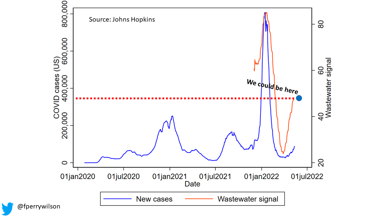
Ok so the CDC wastewater data is a bit weird. It’s all expressed in relative terms, like how high the COVID concentration in wastewater is relative to the highest and lowest it has ever been. But I was able to average that effect out across the country to generate this picture – which reflects national average-ish COVID wastewater signal over time. Note that we have only been getting this data for about six months or so. Now, this might not stand up to peer review, but I think it illustrates a good point.

When test results were being captured, wastewater mirrored the omicron wave pretty well. Now – not so much. Using the wastewater signal, we might estimate that there are nearly 380,000 cases right now, not 90,000.
All told, it feels like a safe bet to assume we are missing around 5-fold the number of cases in the community right now. Put another way, for every person we pick up with a reportable PCR test, there are 4 people testing at home who aren’t being captured.
Add to that the fact that, throughout the pandemic, even when home tests weren’t available, there was a substantial proportion of the population with COVID who simply never got tested. The CDC has variously estimated that number as 2-fold to 4-fold the tested population.
Altogether, then, is it possible that there are 1,000,000 new cases of COVID every day in this country? Yes – it definitely is. The fact that those million cases are not translating into overwhelmed hospitals is simply because the severity of COVID is less in the post-vaccine and, for many of us, post-primary infection era.
But it’s frustrating that we don’t have a better window on this. The ideal study is pretty straight-forward – just do random sampling of the population. Or, we simply stop using case counts as an absolute metric, and, like wastewater, just use them as weathervanes – are cases going up or going down?
Either way, stay safe out there – if your situation is anything like mine, you’ve got COVID all around.
A version of this commentary first appeared on Medscape.com