Sudden Cardiac Death in Young People: More Answers

unexpected-1.jpg

When tragedy strikes, physicians are often asked to answer two questions.  The first is the how question. How did this happen? Long illnesses provide time for patients and family members alike to come to terms with a diagnosis and prognosis. Not always, and not easily, but the time is there.  In the case of sudden cardiac death in a young person, there is no time. Sudden cardiac death is a condition that feels out of place in 2016. That a healthy person can be alive and then, simply, not, feels wrong to modern sensibilities. Nevertheless, the incidence of sudden cardiac death, about 1 per 100,000 young people per year is similar across multiple countries and cultures. Now a manuscript appearing in the New England Journal of Medicine attempts to shed light on how sudden cardiac death can happen. For the video version of this post, click here.

The researchers examined literally every case of sudden cardiac death occurring in individuals less than age 35 in Australia and New Zealand from 2010 to 2012 in a prospective fashion. With each of the 490 cases, they examined autopsy and toxicology reports to determine how the death occurred. While 60% of the cases were explainable by conditions like coronary artery disease and hypertrophic cardiomyopathy, a disturbing 40% had no revealing findings.

So they expanded the search, in a subset of that 40%, the researchers performed advanced genetic sequencing to look for gene mutations that could predispose to sudden death. They found mutations of that type in 27% of the otherwise unexplained cases. While the gap of understanding was narrowed a bit, the how question remained unanswered for many individuals.

sudden cardiac death

Now I should mention that identifying disease-causing mutations is not as easy as it sounds. Most of the mutations identified were classified as “probably pathogenic”. Basically, that means that the mutations are predicted to do harmful things to the protein they affect, but we don’t know for sure at this time.

To take the analysis a step farther, the researchers examined family members of the deceased to screen for the presence of heritable cardiac conditions. In 12 of 91 families screened, such a condition – like long QT syndrome – was found.

So what we have here is a great example of a well-conducted, methodical, and meticulous study that has moved us incrementally towards greater understanding. For some of the families who suddenly lost a loved one – the answer to “how did this happen” is now clear.

Of course that’s only one of the two questions we get asked.  The other is “why did this happen”? And that’s a question that no methodology, no matter how advanced, can answer.

Hypertensive Urgency in the Office: Should You Send the Patient to the ER?

3274162699_a0b18c969a_b-e1466098600672.jpg

You’re in the office seeing a patient, and take a look at the vitals.  Blood pressure 190/110. Being the diligent physician you are, you recheck the blood pressure manually, in both arms, after having the patient relax in a quiet room for 5 minutes.  190/110. There are no symptoms. What do you do? The situation I just described is known as hypertensive urgency, which is a systolic pressure over 180 or a diastolic pressure over 110 without any evidence of end-organ damage. And what to do with patients in this situation is a clinical grey area that, thanks to a manuscript appearing in JAMA Internal Medicine, may finally be seeing the light of day.

For the video version of this post, click here.

The Methods

The study, out of the Cleveland Clinic, gives us some really important data. Here’s how it was done. The researchers identified everyone in that Healthcare system who had an outpatient visit with hypertensive urgency over a 6-year time frame. Of over 1 million visits – just under 60,000, about 5% - had blood pressures consistent with hypertensive urgency. Now, some of those individuals were sent to the hospital for evaluation, the rest were sent home. What percent do you think went to the hospital?

If you answered “less than 1%”, you’re spot on and a way better guesser than I am. I actually assumed the rate would be much higher.  Now, how can we evaluate whether sending someone to the hospital is the “right” move. And let’s not fall into the assumption that sending someone to the hospital is a “safe” option. Those of us who work in hospitals will quickly disabuse anyone of that notion.

The problem is that those who got sent to the hospital were doing worse than those who got sent home. They had higher blood pressures in the “urgency” range, with a mean systolic of 198 compared to 182 in those sent home.

To create a fair assessment of the effects of sending someone to the hospital, the authors performed a propensity-score match.  Basically, they matched the people who got sent to the hospital with people of similar characteristics that didn't. Comparing the matched groups, they found… nothing.

No increased risk of major adverse cardiovascular events.  In other words, the people sent home weren’t having strokes during the car ride.

A curious finding

One thing I did note was that those sent to the hospital were much more likely to have a hospital admission sometime in the next 8 – 30 days compared to those who got to go home.  This either means that some bad stuff happens in that initial hospital referral that leads them to bounce back later in the month or, and I’m favoring this interpretation here, the propensity match didn’t catch some factors that predisposed the hospitalized people to hospitalization in general – factors like socioeconomic status, for instance. If that’s true, then we’d actually expect the hospitalized group to do worse than their controls. The fact that they didn’t may argue that the hospital actually did something beneficial. But we are way down the causality rabbit hole here.

Conclusion

In the end I take home two things from this study.  First, the shockingly low rate of referral to hospital for hypertensive urgency.  Seriously – is this just a Cleveland Clinic thing? Feel free to let me know in the comments.  And two – that for the right patient, a dedicated outpatient physician can probably do just as much good as a costly trip to the ED.

Birth at 41 Weeks = Baby Genius?

baby-1.jpg

A study appearing in JAMA Pediatrics suggests that children born late-term have better cognitive outcomes than children born full-term. As if pregnant women didn’t have enough to worry about. For the video version of this post, click here.

Let’s dig into the data a bit, but first some terms (sorry for the pun). “Early term” means birth at 37 or 38 weeks gestation, “full term” 39 or 40 weeks, and “late term” 41 weeks. In other words, this study is not looking at pre-term or post-term babies, all of the children here were born in a normal range.

Ok, here’s how the study was done.  Researchers used birth records from the state of Florida and linked them to standardized test performance in grades 3 through 10. Compared to children born at 39 or 40 weeks of gestation, those born at 41 weeks got test scores that were, on average, about 5% of a standard deviation higher. To get a sense of what the means, if these were IQ tests (they weren’t) that would translate to a little less than 1 IQ point difference. Not huge, but the sample size of over one million births makes it statistically significant.

10.3% of those born at 41 weeks were designated as “gifted” in school, compared to 10.0% of those born at full-term.

Before I look at what might go wrong in a study like this – is the effect plausible? To be honest, I sort of doubt it. One week extra development in utero certainly will lead to some differences at or near birth, but I find it hard to believe that any intelligence signal wouldn’t simply be washed away amid all the other factors that affect developing young minds prior to age 8.

Now, the authors did their best to adjust for some of these things – race, sex, socioeconomic status, birth order, but it seems likely that there are unmeasured factors here that might lead to longer gestation and better cognitive outcomes – maternal nutrition comes to mind, for example.

We also need to worry about systematic measurement error. These gestation times came from birth certificate data – in other words, many of these measurements may have been some doctors best guess. If the dates were determined by ultrasound, larger babies might be misclassified as later term.  Also, I suspect that if conception dates weren’t well known, a lot of doctors filling out the birth certificate may have just written “40 weeks” to put something in that box.

The authors attempted to look just at women where the likelihood of prenatal care was high, finding similar results, but again, with the tiny effect size, any small systematic measurement error could lead to results like this.

The authors state that this information is relevant to women who are considering a planned cesarean or induction of labor. Currently, the American College of Obstetrics and Gynecology recommends “targeting” labor to 39-40 weeks to avoid some physical complications of late-term birth. In my opinion, having this study change that recommendation at all would be premature.

Migraine: A New Cardiovascular Risk Factor?

Migraine.jpg

I’m going to get personal here.  I had my first migraine - in my life - about three weeks ago. For those of you who have been longtime sufferers, I am truly sorry.  I was literally testing my own neck stiffness to make sure I didn’t have meningitis. But aside from the blistering pain knocking you out of commission for several hours (or several days), a new study appearing in the BMJ suggests there is something else migraine sufferers need to worry about – cardiovascular disease.

For the video version of this post, click here.

Researchers used data from the Nurses Health Study 2, a large, questionnaire-based prospective cohort study that began back in 1989 and enrolled over 100,000 nurses. The idea here was that the nurses (all female by the way) would be more reliable when answering health-related questionnaires than the general public.

In 1989, 1993, and 1995 the questionnaire asked if the women had been diagnosed, by a physician, with migraine. That’s it. No information on treatment, severity, or the presence of aura – a factor that has been associated with cardiovascular disease in the past.

This response was linked to subsequent major cardiovascular events including heart attack, stroke, and coronary interventions.

The researchers found a higher rate of this outcome among those who had been diagnosed with migraine. In fact, even after adjusting for risk factors like age, cholesterol, diabetes, hypertension, smoking, and more, the risk was still elevated by about 50%. So those of us with migraines – is it time to freak out?

Not too much.  The overall rate of major cardiovascular events in this cohort was just over 1% - not exactly common. That means the absolute risk increase is 0.5%, which doesn’t sound quite as dramatic as the 50% relative risk increase.  Putting that another way, for every 200 patients in this cohort with migraine, there was one extra case of cardiovascular disease.  Not exactly a risk factor to write home about.

But, to be fair, cardiovascular disease gets more common as we age – had the study had even longer follow-up, we might have seen a higher event rate.

Other studies have found similar findings with migraine. The women’s health study, for instance, found a nearly two-fold increased risk in cardiovascular events, but only in those who had migraine with aura – a covariate missing from the current dataset.

Should women with migraine take precautions against cardiovascular disease? The jury is out. Since we don’t know the mechanism of the link, if any, we don’t know the best way to treat it.  But clearly any studies of migraine therapy would do well to keep an eye on cardiovascular endpoints.

Now or Never? When to Start Dialysis for Acute Kidney Injury

Timing-is-everything.jpg

An embarrassment of riches this week as we got not one, but two randomized clinical trials evaluating the timing of dialysis initiation in acute kidney injury.  Of course, the results don’t agree at all. Back to the drawing board folks. For the video version of this post, click here.

OK here’s the issue – we nephrologists see hospitalized people with severe acute kidney injury – the abrupt loss of kidney function – all the time.  There is always this question – should we start dialysis before things get too bad, in order to get ahead of the metabolic disturbances, or should we hold off, watch carefully, and jump when the time is right? Several people – and, full disclosure, I’m one of them – have examined this question and the answers have been confusing.  The question begs for a randomized trial.

And, as I mentioned, we have two.  One, appearing in the Journal of the American Medical Association, says yes, earlier dialysis is better with mortality rates of 40% in the early arm versus 55% in the late arm. The other, appearing in the New England Journal of Medicine says there is no difference – mortality rates were 50% no matter what you did.

2

Figure 1: JAMA Trial - GO TEAM EARLY!

3

Figure 2: NEJM Trial - D'Oh!

Sometimes, rival movie studies put out very similar movies at the same time to undercut each other’s bottom line. So which of these trials is Deep Impact, and which is Armageddon? Which is Ed TV and which is the Truman show? Which is Jobs and which is Steve Jobs?

jobss

Figure 3: It's like looking in a mirror...


In this table I highlight some of the main differences:

4

The NEJM trial was bigger, and multi-center, so that certainly gives it an edge, but what draws my eye is the difference in definitions of early and late.

The NEJM study only enrolled people with stage 3 AKI – the most severe form of kidney injury. People in the early group got dialysis right away, and the late group got dialysis only if their laboratory parameters crossed certain critical thresholds.  The JAMA paper enrolled people with Stage 2 AKI. In that study, early meant dialysis right after enrollment, and late meant dialysis started when you hit stage 3.

OK so definitions matter. The NEJM trial defined early the way the JAMA trial defined late. So putting this together, we might be tempted to say that dialysis at stage 2 AKI is good, but once you get to stage 3, the horse is out of the barn – doesn’t matter when you start at that point.

That facile interpretation is undercut by one main issue: the rate of dialysis in the late group.

5

See, one of the major reasons you want to hold off on dialysis is to see if people will recover on their own. In the JAMA study, enrolling people at stage 2 AKI, only 10% in the late group made it out without dialysis – and those people were dialyzed, on average, only 20 hours after randomization. In the NEJM study, using the more severe inclusion criterion, roughy 50% of the late group required no dialysis. To my mind, if 91% of the late group got dialysis, you’re not helping anybody – the whole point of not starting is so that you never have to start, not that you can delay the inevitable.

Regardless of your interpretation, these studies remind us not to put too much stock in any one study. They should also remind us that replication – honest to goodness, same protocol replication – is an incredibly valuable thing that should be celebrated and, dare I say, funded.

For now, should you dialyze that person with AKI? Take heart – there’s good evidence to support that you should keep doing whatever you’ve been doing.

Does Hope Hurt? Predicting Death at the End of Life

death-and-dying.jpg

"There's always hope". This is a statement I have used many times when discussing the care of a patient with a terminal illness, but I have to admit it always felt a bit pablum. I think it ends up being short hand for "none of us are ready to accept reality so here we are". A few years ago I stopped saying that when I believe a patient is terminally ill.  Instead I state that the patient has reached the end of his or her life, and its time to plan for that.

For the video version of this post, click here.

Because hope can harm dying patients. Hope leads to unnecessary medical interventions, invasive treatments, and delayed palliative care. Up until now, we haven't had great data on how physicians and caregivers perceptions of a patient's prognosis line up, and why they differ. Appearing in the Journal of the American Medical Association, a well-designed trial finally sheds some light on this issue.

Researchers at UCSF enrolled 227 surrogates of patients who were mechanically ventilated for at least 5 days in the ICU. Overall, 43% of these patients would die during their hospitalization. On that fifth day, the surrogate and the physician were asked, independently, what they thought the patient's chances of surviving the hospitalization were. A margin of 20% difference was classified as "discordant".

And 53% of the estimates were discordant. In the vast majority, 80%, of discordant cases, the surrogate caregiver was more optimistic than the physician.

What sets the study apart for me is that it didn't end with this fact.  Rather, using structured interviews, the researchers identified factors that led to this overly optimistic view. They fell in several broad categories. Most commonly cited was the sense that holding out hope – or thinking positively – would directly benefit the patient. One participant for instance stated "I almost feel like if I circle 50%, then it may come true. If I circle 50%... I'm not putting all my positive energy towards my dad".

The other explanations for discordance included a feeling that the patient has secret strengths unknown to the physician. And finally, religious beliefs – the idea that ultimately God would intervene on behalf of the patient, were also frequently cited.

As I mentioned, some surrogates were more pessimistic than the providers, and typically cited self-preservation for that outlook.  As one individual put it "Maybe I'm just trying to protect myself… I'm trying not to get too excited or… optimistic about anything".

Physician's prognoses were statistically better than surrogates at predicting the eventual outcome, but pride in this fact would be misplaced. "Doctor" comes from the latin word for teacher, and we need to do a better job educating patient's families about their loved-one's prognosis. Those conversations are hard, and offering some hope is what every empathetic human would do, but maybe it's time that, in some cases, we offer hope for a noble and peaceful death as opposed to a miraculous return to life.

Amyotrophic Lateral Sclerosis and Environmental Toxins: A New Link?

shutterstock_30797446-620x620.jpg

An article appearing in JAMA Neurology links exposure to certain environmental toxins, like pesticides to Amyotrophic Lateral Sclerosis (ALS or Lou Gehrig’s disease). While I could spend these 150 seconds talking about whether or not we should run home and clean all the Round-Up out of our garage, I’d like to take this chance to talk about 3 methodologic issues a study like this brings to the fore. For the video version of this post, click here.

But first, the details:

Researchers from the University of Michigan performed a case-control study of 156 individuals with ALS and 128 controls. They administered a survey, asking about all sorts of environmental exposure factors, and, importantly, they drew some blood to directly measure 122 environmental pollutants. The bottom line was that there did seem to be an association between some pollutants (like pentachlorobenzene – a now-banned pesticide) and ALS.

So – on to the three issues.

Number 1 – multiple comparisons. As I mentioned, the authors looked at over 100 pollutants in the blood of the participants. Given no effect of the pollutants, chance alone would leave you with several apparently statistically significant relationships.  In fact, a robust demonstration of the multiple comparisons problem is that lead exposure, in this study, was quite protective against ALS. This is not biologically plausible, but reflects that multiple comparisons can cut both ways – it can make measured factors seem to be positively, or negatively associated with the disease. Indeed, several pollutants seemed to protect against ALS.

The authors say they account for multiple comparisons, but I’m not sure this is true. In their statistics section, they write that they used a Bonferroni correction to lower the threshold p-value (from the standard 0.05 to 0.0018 to account for all the comparisons). But they never actually do this.  Rather, they report the odds ratios associated with the various pesticides and just don’t report the p-values at all, except in multivariable models where the Bonferroni correction isn’t used.

Number 2 – the perils of self-reported data. The survey exposure data – questions like “do you store pesticides in your garage?” and the measured blood data were hardly correlated at all. This should be read as a warning to anyone who wants to take self-reported exposure data seriously (I’m looking at you, diet studies). When in doubt, find something you can actually measure.

And Number 3 – the lack of variance explained. Studies like this one that look at risk factors for an outcome are building models to predict that outcome. The variables in the model are things like age, race, family history, and the level of pentachlorobenzene in the blood. It’s a simple matter of statistics to tell us how good that model fits – how much of the incidence of ALS can be explained by the model. We almost never get this number, and I suspect its because you can have a highly significant model that only explains, say, 1% of the variance in disease occurrence. It doesn’t make for impressive headlines.

So while we haven’t learned which, if any, organic pollutant causes ALS, hopefully we’ve learned something about the perils of risk factor research.

"Price Transparency" Doesn't Curb Spending In Medicine

health-costs.jpg

I love price transparency. When I book an airline seat, I will base my entire decision around the fact that one flight is $3 cheaper. Leg room be damned. But does price transparency work in the healthcare industry? A study appearing in the Journal of the American Medical Association may be telling us something important: Healthcare isn't like other industries.

For the video version of this post, click here.

What you will pay for a given office visit or procedure is a nebulous thing at the best of times. While websites have sprung up offering comparison shopping for things like mammograms, colonoscopies, and hernia repairs, it's often hard to know exactly how that advertised price will interact with your own insurance plan, deductible, and various co-pays. In other words, price shopping in medicine is really hard.

The JAMA study looked at two very large corporations that partnered with Truven Health Analytics (recently purchased by IBMs Watson group) to give their employees access to a robust cost-comparison tool.  The cool part about the tool is that it included information about your own health plan, including how much of your deductible you'd spent so far, to give really accurate estimates of out-of-pocket and total costs for various procedures and visits.

The researchers compared spending habits among employees in the year prior to the tool being available with the year after, using matched controls to account for secular trends.

And it didn't work.  At least, if the hope was to get people to spend less on healthcare.  In fact, those who had access to the tool spent a bit more than those who didn't (roughly 60 dollars a year more – not much, but hardly the "billions saved" that the Truven website promises). Moreover, the transparency tool users were more likely to use pricey hospital-based outpatient departments instead of freestanding clinics.

The more interesting questions is – why?

Well, for one thing, not many people bothered to use the tool – about 10% of employees tried it out in that first year. Additionally, the tool reported both out-of-pocket and total costs. It's conceivable that, when presented with the same out-of-pocket cost, a reasonable human might choose the service with a higher total cost – after all that's the better deal, right? The researchers point out that most of the searches on the web tool were for procedures that would exceed the deductible, making price-shopping more or less moot.

Finally, let's not forget that healthcare is not really a commodity. Patients like their doctors, their health system. There is real value in getting care all in one place.

So healthcare is not where the airline industry is, which I'm sure is a relief to hospital CEOs nationwide. For price transparency to really matter, we would need a radical change to our insurance policies. But that is something most patients, and most politicians wouldn’t buy.

Arsenic in the Baby Food - Time to Panic?

12-3-rice-health-toxic-metals.jpg

Giving a baby their first bite of real food – it’s an indelible memory. That breathless moment as you wait to see whether it will be swallowed or unceremoniously rejected, the look of astonishment on their little face. For many of us, that first bite was rice cereal – gentle on the stomach, easy to mix with breast milk or formula, safe, trusted, traditional. Well it turns out we’ve been poisoning our children all along.  Well, at least that’s what a paper appearing in JAMA Pediatrics would have you believe.

For the video version of this post, click here.

The relevant background here is that arsenic, in sufficient quantities, kills you. And rice, in part because it is often grown in flooded paddys, concentrates arsenic. And between rice cereal, rice-based formula, and those little puffy rice treats, infants eat a fair amount of rice.

In this study, researchers from Dartmouth examined 759 infants enrolled in the New Hampshire Birth Cohort study. Rice consumption was pretty common – when surveyed at 12 months of age, the majority of babies had consumed some rice product within the past 2 days.

In a subgroup of 129 infants, the researchers examined total urinary arsenic levels and correlated them with food diaries taken at several points over their first year of life. Sure enough, the kids who had eaten more rice products had higher levels of urinary arsenic. Kids who had no rice consumption had an average urinary arsenic concentration of around 3 parts per billion, compared to around 6 parts per billion among those who had been eating white or brown rice. Breaking it down farther, the highest arsenic levels were seen in kids eating baby rice cereal – around 9 parts per billion.

But… does it matter? The CDC lists arsenic as a known carcinogen, but it is often hard to find precise toxic dose numbers.  Here’s what I’ve dug up.  It looks like the lethal dose is around 2mg/kg. To get that dose, a 5 kilogram infant would need to ingest, in a short period of time, roughly 50 kilograms of strawberry flavored puffed-grain snacks.  That was the food with the highest arsenic levels in this study.

But chronic, sub-lethal exposure to arsenic may also be harmful. As I mentioned above, arsenic is a known carcinogen. There is also some mixed data that suggests that high arsenic exposure can lead to lower intelligence scores in children, though the levels measured in those studies are about ten times what we see here.

The bottom line is, we don’t know if this is a big problem. My impression is that arsenic contamination of drinking water is more problematic than the arsenic content of foods.  So yeah, avoiding rice-containing products may get the arsenic levels in infants from very low to very very very low, but what shall we give them instead? Arsenic is just one potential toxin in one group of foods. In this modern world, you may have to pick your poison.

New Drugs Hold Real Promise for Metastatic Melanoma

cancer-389921_1920.jpg

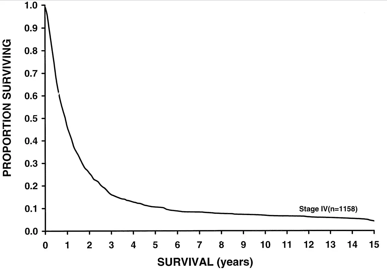
I'm going to show you a survival curve for metastatic melanoma. Survival rate in metastatic melanoma

This data was analyzed in 2001, but sadly, even current 5 year-survival for metastatic melanoma sits around 15%. But some new drugs might change this.

For the video version of this post, click here.

Here's a chart examining Melanoma-associated mortality rates over time:

Death rates in advanced melanoma

Compare that to breast cancer, which has seen some dramatic therapeutic advances over the past few decades:

Breast cancer mortality rate is declining

But melanoma is riding a wave of novel immunotherapies that hold promise to change the treatment landscape substantially.

Appearing in the Journal of the American Medical Association is a type of study we don't see too much of these days.  It's not really a clinical trial. It's not really a meta-analysis.  Frankly, I'm not sure what to call it – an aggregate analysis perhaps?

The study examines 655 patients treated with the PD-1 inhibitor pembrolizumab from 2011 to 2013. Yup, that's the same pembrolizumab which was used so successfully to treat this charming former president:

Malaise my ass

A brief aside here. Pembrolizumab is a monoclonal antibody directed towards programmed cell death protein 1, PD-1. PD-1 acts to prevent immune cells from attacking your own cells – it's an immune "checkpoint" making pembrolizumab one in a class of "checkpoint inhibitors".  Basically, by blocking PD-1, pembrolizumab allows your immune system to attack your own cells. Not something you want under ordinary circumstances, but perhaps beneficial when your own cells have turned against you.

Merck has bet big on pembrolizumab, with clinical trials ongoing or planned in melanoma, non-small-cell lung cancer, small-cell lung cancer, ovarian cancer, glioma, colorectal cancer, and on and on. What happens when a company is doing so many trials like this is a kind of fractionation, where you lose the aggregate knowledge of patient experiences because they are spread out across so many trials.

So I was gratified to see this aggregate analysis which examined patients with advanced melanoma receiving pembrolizumab across four different trials. See, if you do four trials, and one is nice and positive, and the others are equivocal, and you are a for-profit drug company, maybe you're more likely to try to get that positive trial into some high-profile journal, and let the others either languish in peer-review hell or get published in an out-of-the-way rag.

What we get in JAMA, though, is a study with adequate power to demonstrate that pembrolizumab might make a difference.

Among all the patients treated with pembrolizumab (and yes, there is no control group reported here), the objective response rate was 33%. The median overall survival was 23 months, and 31 months among those for whom pembrolizumab was the first systemic cancer therapy.  Compared to the historical median survival of under a year, this represents a substantial improvement.

Interestingly, among those who responded to the drug initially, the duration of response was fairly long. In fact, at 2 years, around 70% of people who initially responded to the drug were still responding.  This is a good thing, as it demonstrates that development of resistance to therapy might be limited.

Now, before we bestow too many accolades on Merck for giving us this aggregate data, we might ask whether they would have been as forthcoming if the trials weren't quite as successful. But, placing cynicism aside for the moment, it seems that this drug, or one of its competitors will have a place at the table in the treatment of advanced melanoma.